
One Room Challenge - Week 2

Let's jump into my thought process as I designed my new kitchen for the One Room Challenge.
Like I said last week, I felt like the previous remodel didn't fit with the house - both style wise as well as the layout. People who came over would say, "You're kitchen is so small!" when actually, it's a decent size - about 13' x 18'.
All of the living areas in this house are open to one another as well as to the outside. That means the colors and finishes all need to flow into one another and feel cohesive.
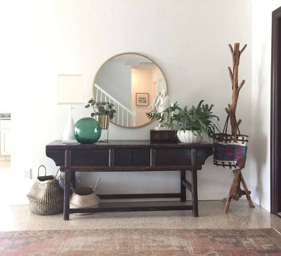
entry
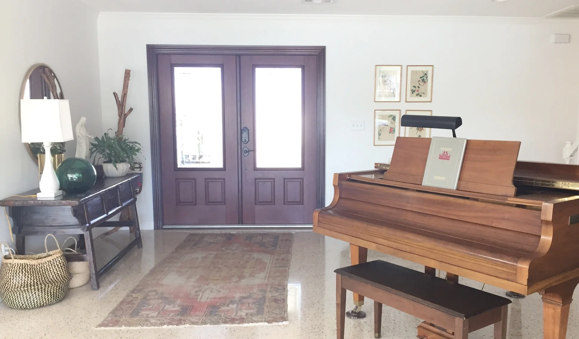
entry

living room/dining room

dining room
Let me apologize right now for how blown out these pictures are. We get a TON of light in these windows and sunshine everyday (yay, Florida!) so getting good pictures is really hard.

kitchen via dining room

kitchen via entry
Moving on to the layout. Hopefully you can tell from the pictures how chopped up and crowded the floor plan in the kitchen is. We came up with this:

We're taking out the little seating island (which is right in the way of everything) and extending the central island by a few feet. The wall that backs up to the entry area is going to be cut back to improve visibility and fitted with 15" deep pantry cabinets to make more room for walking and working around the island. The sink and dishwasher will be moved to the island, and the range is going to be moved to the long wall between the windows.
This reconfiguration means we are going to have to tunnel under the floor to run water, drain and electricity to the island. If that doesn't work they are going to have to tear up part of the terrazzo floor and patch it. We tried to find another solution, but this was the only layout that really works both aesthetically and functionally..

This is a rendering of the kitchen looking in from the dining room. In order to keep the light coming in from the windows, we are putting shelves over the windows for storing dishes rather than upper cabinets.


Now, on to finishes!
In keeping with the style of the rest of the house, I wanted a light, fresh, modern feeling in here. Mid-century with a bit of cozy beach bungalow.


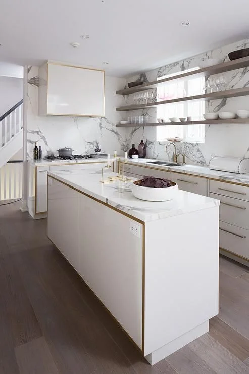
source


I had the hardest time deciding on cabinet color. I love the look of a warm wood, but we already have so much wood in our piano, coffee table and the window seat in the dining room. Whatever we chose needed to compliment the terrazzo floors, which have a bit of warm brown in them, as well as a lot of gray.
(For those of you who may be wondering, terrazzo is basically a colored concrete slab with flecks in it. They tell me the flecks are bits of glass that are mixed in at the time the slab is poured and then polished. It's a very common flooring in Florida, especially for homes built in the 50s and 60s.)

In the end I decided on gray cabinets. The shelves over the windows will be wood, as well as the counter stools.

Stainless appliances, gold faucet and pot filler, marble countertops, black pulls and basket pendants. Oh, yeah, and that cement tile.